YouTube Thumbnail Generator: Create Click-Worthy Thumbnails Without a Designer
November 15, 2025 by Jake MorrisonLast updated: May 13, 2026
Let's be honest about something uncomfortable: the average viewer decides whether to click your video in about 0.4 seconds. That's less time than it takes to blink twice. And in that fraction of a second, your thumbnail is doing all the work.
This isn't speculation. YouTube's own internal data has consistently shown that thumbnail quality is one of the top factors affecting a video's click-through rate. The gap between a 4% CTR and a 12% CTR on the same video, with different thumbnails, can mean the difference between 500 views and 1,500 views from the same number of impressions.
Most creators know this. The problem is acting on it.
Hiring a graphic designer for thumbnails costs between £50–£200 per thumbnail in the UK, $60–$250 in the US, and roughly $80–$300 AUD in Australia. If you're uploading twice a week, that's a serious budget line before you've even started. And even if you can afford it, the turnaround time often means you're uploading the video and slapping on something rushed anyway.
This is exactly the gap that AI thumbnail generators are filling.
Why Most Creator Thumbnails Underperform
Before we talk about solutions, it's worth understanding why the problem exists at all.
The average creator taking a selfie or screenshot for their thumbnail is working against several fundamental design principles without realising it:
Contrast and readability at small sizes. YouTube thumbnails display at 320×180 pixels on most mobile devices. Text that looks fine on your monitor becomes illegible soup at that size. Professional thumbnail designers know to use maximum contrast, thick outlines on text, and colours that pop against YouTube's white and dark backgrounds.
Composition for the 16:9 frame. Thumbnails aren't portraits. The 16:9 aspect ratio needs to be used strategically — face on one side, text on the other, visual breathing room in the right places. Cramming a square selfie into that space creates dead zones and wasted real estate.
The curiosity gap. The best thumbnails leave something unsaid. They create a question in the viewer's mind that can only be answered by clicking. A flat photo of someone sitting at a desk answers nothing and creates no tension.
Emotional amplitude. Expressions in high-performing thumbnails are always exaggerated relative to real life. A mildly surprised expression reads as blank on a thumbnail. You need wide eyes, open mouth, raised eyebrows — the kind of expression you'd never hold in a normal conversation.
Knowing this intellectually is one thing. Executing it without design skills or an expensive software subscription is another.
The 4 Thumbnail Styles That Actually Drive Clicks
Across successful channels in every niche — finance, fitness, education, tech, lifestyle — four thumbnail styles consistently outperform everything else.
1. Bold Text Overlay
The most versatile style. A dynamic image (often the creator in action) combined with massive, high-contrast text that contains the hook. Think "I MADE £10K IN 30 DAYS" or "HOW I GREW TO 100K SUBS" in thick, outlined Impact-style lettering.
This style works because it doubles down on the title without repeating it word for word. YouTube shows the video title directly below the thumbnail, so your text should add information or emotional charge rather than duplicate the title.
Best for: personal finance, entrepreneurship, fitness challenges, challenge/results videos.
2. Face Reaction
A tight close-up of the creator's face showing genuine surprise, excitement, or disbelief. The expression should be real, not stock-photo-generic. Viewers are wired to respond to facial expressions — it's evolutionary. A compelling face with a bright, clean background and a 3-word text overlay is one of the most reliable formulas in YouTube history.
MrBeast didn't build the world's most-subscribed channel using varied, experimental thumbnail styles. He picked one format and optimised it relentlessly.
Best for: reaction content, news commentary, challenge reveals, personal story videos.
3. Clean and Minimal
Going against the typical "more is more" approach, this style uses whitespace, professional lighting, and restrained typography. Think top YouTube educators — Ali Abdaal, Thomas Frank, Marques Brownlee (MKBHD). The premium, trust-building aesthetic signals that this is serious, high-quality content.
Clean thumbnails tend to work better in certain niches (tech, productivity, finance, self-improvement) where the audience skews older and is more suspicious of sensationalist thumbnails. They stand out precisely because they don't follow the crowd.
Best for: tech reviews, productivity, education, professional development, personal finance.
4. Action Shot
A freeze-frame at peak energy — pointing directly at the viewer, gesturing dramatically, or caught mid-motion. The directional energy of the composition draws the eye and implies urgency. Text like "WATCH THIS BEFORE IT'S TOO LATE" or "DO THIS NOW" matches the kinetic energy of the image.
This style works because it treats the thumbnail like a cinematic movie poster: every element implies forward momentum. Nothing is static.
Best for: tutorial videos, urgent advice, time-sensitive content, how-to guides.
What Makes a Thumbnail Generator Actually Useful
Not all YouTube thumbnail generators are created equal. Most free tools online are essentially template libraries — you pick a pre-made layout, swap out text, upload a photo. That's better than nothing, but it doesn't solve the fundamental problem: the quality of the base photo.
If you upload a flat, badly-lit selfie into a template, you get a flat, badly-lit selfie with some text on it. The template doesn't fix the lighting, improve the expression, or recompose the shot.
A genuinely useful AI thumbnail generator does something different: it takes your photo and transforms it. Better lighting. More dynamic expression. Composition adjusted for the thumbnail format. The result isn't "your photo in a template" — it's a new image that happens to be based on your photo.
This is the difference between a thumbnail generator and an AI thumbnail generator. The AI part actually matters.
What to Look For
When evaluating any thumbnail generation tool, ask these questions:
- Does it understand 16:9 composition, or does it just crop a portrait photo?
- Can it add bold, readable text overlays at the right size for mobile viewing?
- Does it boost contrast and saturation appropriately for thumbnail contexts?
- Can it generate multiple style variations from a single photo?
- What's the output resolution? You need 1280×720 pixels minimum for YouTube.
The last point is often overlooked. YouTube recommends 1280×720 at a maximum file size of 2MB. Many AI tools output at lower resolution or lose quality in compression. You want crisp, high-definition thumbnails that look professional even on retina displays.
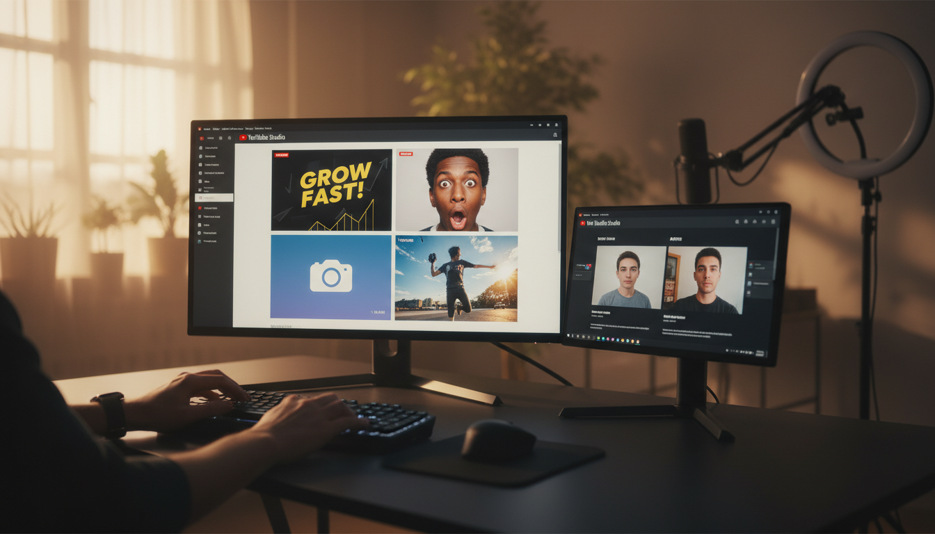
How BrandForge AI Generates Thumbnails From Your Photos
Here's how the process actually works when you use an AI tool like BrandForge AI:
Step 1: Upload your photo. This can be a casual selfie, a screenshot from your video, or any photo where you're clearly visible. The worse the original photo, the more dramatic the transformation — this is actually ideal.
Step 2: Describe your video topic. Tell the AI what the video is about in one line. "How I grew my Instagram following from zero to 10,000" or "My honest review of the new MacBook Pro." This gives the AI context to choose appropriate text overlays and emotional tone.
Step 3: Choose a thumbnail style. Pick from Bold Text Overlay, Face Reaction, Clean & Minimal, or Action Shot. The AI will generate a version in your chosen style.
Step 4: Get your 4 thumbnail variations. Within 30 seconds, you receive four fully-formed thumbnail options at 1280×720, each in a different style. Download the one that fits your video, or A/B test two of them.
The AI handles: lighting adjustment, expression enhancement, composition for 16:9, text sizing and placement, contrast boosting, and format-appropriate colour grading. You handle: uploading your photo and describing your video.
Thumbnail A/B Testing: The Underused Advantage
One of the most significant improvements YouTube made to its creator tools was built-in A/B testing for thumbnails (available via YouTube Studio's "Test & Compare" feature in select regions). For channels that have access to it, this is transformative.
The challenge with A/B testing thumbnails, historically, was that you needed at least two professionally-made thumbnails to test. If each one costs money or time, you'd only do it occasionally. With an AI generator, you can create four variations of a thumbnail in the time it would take to open Photoshop, then test them all systematically.
This changes the thumbnail game from art to science. Instead of guessing which style will resonate with your specific audience, you find out.
Technical Specs: Get This Right
Regardless of which tool you use, make sure your final thumbnail meets YouTube's specifications:
- Resolution: 1280 × 720 pixels (720p minimum)
- Aspect ratio: 16:9
- File size: Under 2MB
- Format: JPG, PNG, GIF, or BMP
- Text readability: Must be legible at 320 × 180 (phone display size)
One thing many creators miss: your thumbnail competes not just against other videos in the feed but against YouTube's auto-generated thumbnail options. If you don't set a custom thumbnail, YouTube picks a frame from your video — often mid-sentence with your mouth open. Setting a custom thumbnail is non-negotiable.
Thumbnail Mistakes That Tank Your CTR
Some patterns reliably underperform regardless of niche:
Text that matches the title exactly. Redundant. The title is shown below the thumbnail. Your thumbnail text should add context, not repeat.
Too many elements. Three logos, a border, three lines of text, an emoji — thumbnails are not where you express your full creative range. Every element added reduces the impact of every other element.
No human face. Videos with faces in thumbnails consistently outperform those without, across almost every category. Even if your video isn't about you, consider a reaction or commentary frame.
Background clutter that competes with the subject. In a busy feed, visual noise makes your thumbnail invisible. Clean backgrounds or blurred backgrounds keep the viewer's eye where you want it.
Safe, safe, safe. Thumbnails that feel too polished and corporate can underperform because they lack the authentic energy that YouTube's algorithm rewards. The platform's audience expects a certain rawness, even from professional channels. The best thumbnails feel urgent, not manicured.
Niche-Specific Thumbnail Strategy
Thumbnails don't work the same way across all niches. Here's a quick reference:
Finance and business: Clean & Minimal or Bold Text Overlay. The audience is results-oriented; lead with numbers. "£47K in 6 Months" outperforms "How I Made Money Online."
Fitness and wellness: Action Shot or Face Reaction. Energy and transformation are the emotional hooks. Before/after compositions (when appropriate) have historically very high CTR in this niche.
Tech and reviews: Clean & Minimal or product-focused composition. This audience is sceptical of hype; overproduced thumbnails can backfire. Clear product shots with minimal text work well.
Education and tutorials: Bold Text Overlay with the main takeaway as the text. The viewer should understand the value proposition before clicking. "Master Excel in 20 Minutes" is a better thumbnail text than "Excel Tutorial."
Lifestyle and vlog: Face Reaction is the dominant style. The emotional connection to the creator is the whole product; lead with the face.
Building a Consistent Thumbnail Brand
Top channels don't just make good individual thumbnails — they develop a recognisable visual identity across their thumbnails. Viewers start to recognise the channel's thumbnails in their feed before they read the channel name.
This consistency usually comes from three elements:
Colour scheme. One or two dominant colours used consistently across all thumbnails. MrBeast is synonymous with bright yellow. Channels in the finance space often go deep blue or dark green. Pick two and use them.
Font. Same typeface, same weight, same style of text across every thumbnail. This creates brand recall in the feed.
Composition pattern. If you always put your face on the left and text on the right, viewers start to recognise that layout as yours. Consistency accelerates familiarity.
When you're generating thumbnails with AI, you can specify these brand elements and get thumbnails that are not just high-quality but also brand-consistent. This is where AI thumbnail generation starts to create genuine, compounding value.
Start Creating Thumbnails That Actually Get Clicked
If you're uploading videos and using whatever screenshot YouTube grabs, or spending hours in Canva trying to make something decent, the workflow we've described is worth trying.
Upload a photo. Describe your video. Get four professional thumbnails in 30 seconds.
The difference in click-through rate adds up quickly. A 3% improvement in CTR across 52 videos a year isn't a small thing — it's the kind of compound advantage that separates growing channels from stagnating ones.
Try BrandForge AI free — no credit card required
Related reading
Frequently Asked Questions
What size should a YouTube thumbnail be?
YouTube recommends 1280×720 pixels (16:9 aspect ratio), with a minimum width of 640 pixels and a file size under 2 MB. JPG, GIF, and PNG are accepted. Designing at 1280×720 also means the thumbnail looks crisp on mobile, where most YouTube viewing happens.
Does an AI-generated thumbnail get penalized by YouTube?
No. YouTube has no policy against AI-generated thumbnails. The platform's only thumbnail rules concern misleading content, nudity, hate symbols, and violence — none of which are tied to whether a human or AI created the image. Your CTR is the only thing that matters.
What makes a thumbnail click-worthy?
Three signals do most of the work: a clear focal subject (usually a face or a single object), high contrast between subject and background, and a short text overlay (under five words) that creates curiosity rather than describing the video. Bright, saturated colors typically outperform muted palettes.
Should every thumbnail in my channel look the same?
A consistent visual identity — same font, same colour treatment, same framing — helps subscribers recognise your videos in their feed. But thumbnails should not be visually identical. Vary the subject, expression, or composition while keeping the identity cues constant.
How do I A/B test thumbnails?
YouTube's Test & Compare feature (rolled out broadly in 2024) lets creators upload up to three thumbnail variants per video. YouTube runs the test and selects the winner based on actual viewer behaviour. Generate two or three AI variants per video and let YouTube pick the strongest.
Why are AI thumbnails faster than hiring a designer?
A designer typically takes 24–48 hours per thumbnail at $20–$80 each. An AI thumbnail generator produces a draft in under a minute, with revisions in seconds. For creators publishing 2+ videos a week, the time and cost difference compounds quickly.