AI Image Refinement: A Step-by-Step Guide
August 20, 2025 by Priya SharmaLast updated: May 13, 2026
We've all been there. You spend time crafting what feels like a solid prompt for an AI image generator, hit generate, and get something that's... close. The lighting is a bit flat. A background element is distracting. The composition doesn't quite work. The subject's expression isn't right.
The old way? Start over. Write a new prompt, cross your fingers, and hope for the best.
The new way? Refine.
Iterative AI image refinement is the most powerful technique for moving beyond generic AI outputs to creating professional, on-brand visuals that match your exact vision. And it's significantly more efficient than starting from scratch each time. This guide walks through a complete example, then gives you the principles and commands to apply it to any image you're working on.
The myth of the perfect first prompt
The idea that great AI images come from great prompts is only half true. Yes, a well-structured prompt produces a better starting point. But the most skilled AI image users don't think in terms of the perfect prompt — they think in terms of a refinement workflow.
The first generation is a rough draft, not a deliverable. Your job is to direct it toward what you actually want through a series of targeted, incremental adjustments.
This matters for two reasons:
First, it's psychologically freeing. You stop trying to anticipate every detail in advance (which is impossible) and start treating generation as a conversation.
Second, it produces dramatically better results. Incremental refinement gives you control over specific elements without risking the loss of things that are already working. Starting fresh every time means potentially losing good composition, good lighting, or a good face to correct one detail that bothered you.
A complete step-by-step example
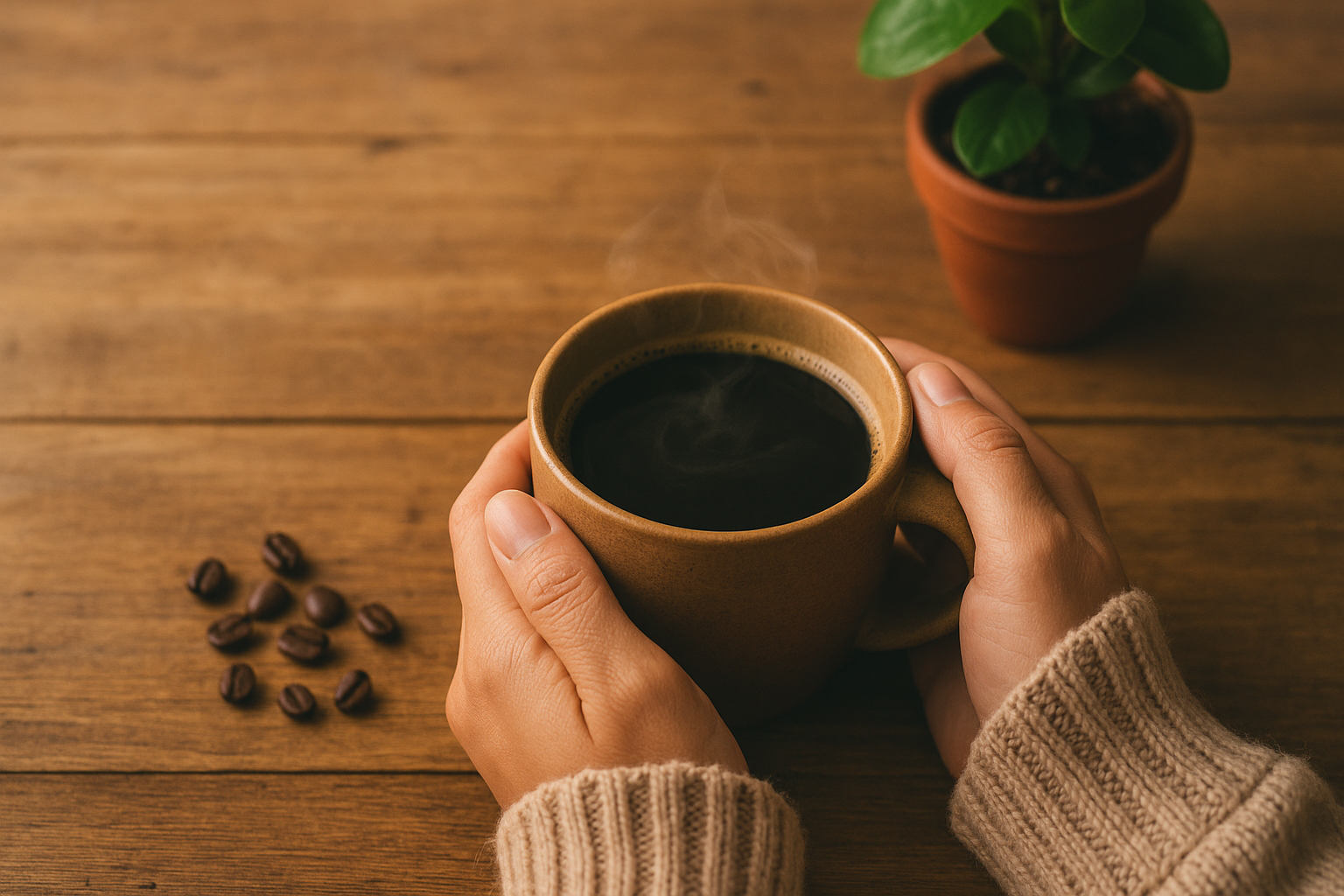
The scenario: A hero image for an eco-friendly coffee brand
Our brand is "TerraBrew," a sustainable coffee company. We need a hero image for the website that feels warm, natural, and premium.
Starting prompt: A cup of coffee on a wooden table.
Step 1: Generate the rough draft
The AI gives us a result. It followed the prompt — there's a coffee cup on a wooden table. But it's generic, lifeless, and tells no story. The lighting is flat. The composition is uninspiring. The background is ambiguous.
This is normal and expected. This is your rough draft, not your failure.
What to do: Identify the biggest gap between this output and the image you want. Don't try to fix everything at once. Pick the single most important thing.
In this case: the lighting and atmosphere. Without those, the image will never feel premium regardless of other details.
Step 2: Add atmosphere and light
Refinement instruction: Add soft morning sunlight streaming in from a window on the left, creating gentle shadows across the table.
The scene now has depth and warmth. There's a specific time of day. The light creates shadows that add dimension. The image has moved from "product photo" to "lifestyle scene."
Key principle: Lighting is foundational. Establish it early in your refinement sequence before adding detail — light affects how every other element reads.
Step 3: Add context and brand elements
The scene looks good but still feels like a coffee stock photo, not a TerraBrew photo. We need brand-specific elements.
Refinement instruction: Place a few scattered coffee beans and a small green plant in a terracotta pot near the cup. Add a small printed card with earthy tones leaning against the cup.
This adds product authenticity (the coffee beans), brand values (the plant signals eco-friendliness), and visual interest (the card breaks up the symmetry). The image now has a personality.
Key principle: Brand specificity is what makes a good image a useful image. Generic beauty doesn't build brand recognition. Specific visual cues — your brand colors, your signature props, your aesthetic references — do.
For more on maintaining brand consistency across all your visual content, see: AI and Brand Consistency: Maintaining a Unified Voice Across All Platforms.
Step 4: Add a human element
The scene is beautiful but lacks the most powerful element in lifestyle photography: a person.
Refinement instruction: Add a person's hands holding the coffee mug, with cozy knit sweater sleeves visible. Hands should be relaxed and natural-looking.
Now the image has emotion. It's no longer about a product — it's about an experience. The cozy sweater adds warmth and seasonal context. The hands make the image relatable in a way that no amount of lighting or props can achieve.
Key principle: Human presence creates connection. Even partial human elements — hands, a shoulder, a blurred figure in the background — significantly increase engagement and relatability compared to product-only images.
Step 5: Final polish
The image is strong. One small detail will make it feel alive rather than like a photograph of a cold cup.
Refinement instruction: Add a gentle wisp of steam rising from the coffee cup.
Steam signals freshness. It gives the viewer's eye a subtle point of movement. It's a small detail, but it's the kind of detail that separates an image that looks like a photo from one that feels like a memory.
Key principle: Small final details — steam, condensation, dust particles in light, a slight lens flare — create the tactile and sensory quality that makes images feel real rather than generated.
The refinement principles
The five-step example above illustrates the core principles of effective AI image refinement:
One change at a time
The most common mistake in AI image refinement is giving multiple instructions simultaneously. "Make the lighting warmer, add more depth of field, include some foliage, and change the background to a café setting" will produce an unpredictable result where you don't know which element caused which change.
Give one instruction. Evaluate the result. Give the next instruction. This gives you control and makes the refinement process debuggable.
Start with structure, finish with detail
Refinement works best in layers:
- Lighting and atmosphere — the most foundational, affects everything else
- Composition and scene elements — add or remove objects, adjust framing
- Brand and identity elements — colors, props, visual cues specific to your brand
- Human elements — people, hands, expressions, interaction
- Final polish — micro-details that add realism and life
Reversing this order (polishing details before the composition is right) wastes effort.
Use descriptive, not evaluative, instructions
"Make it better" tells the AI nothing. "Increase the contrast between the subject and the background by deepening the shadow on the right side" tells it exactly what to do.
Good refinement instructions describe a specific visual change in concrete terms. Poor instructions evaluate the result without specifying the change.
Weak: "The lighting doesn't look right." Strong: "Warm the light temperature to give the scene golden hour quality, similar to late afternoon sun."
Weak: "The background is too distracting." Strong: "Blur the background to a shallow depth of field, keeping only the coffee cup in sharp focus."
Connect each refinement to your brand
Before each refinement step, ask: "How does this change reinforce the brand story?" Adding a green plant to a sustainable coffee brand image isn't just a visual choice — it's a brand statement. Using warm earth tones rather than cool blues is a brand decision. Every refinement is an opportunity to make the image more specifically yours.
Don't be afraid to go back
If a refinement step moves the image in the wrong direction — takes away something that was working, introduces an unwanted artifact, or changes the mood — don't keep trying to fix it from that point. Go back to the previous good version and try a different instruction. Most AI refinement tools allow you to branch from any previous state.
Watch for refinement drift
One risk that's easy to miss: after many small changes, an image can drift far from your original brand direction without any single step feeling like a big departure. You started with a warm, earthy coffee scene and ended up with something that looks sleek and clinical — and you can't point to the exact moment it shifted.
The fix is to periodically compare your current version against your original. If the overall mood or brand alignment has shifted in a direction you didn't intend, it's often faster to go back three or four steps and try a different path than to try to "correct" your way back from where you are. Think of refinement drift the same way you'd think of scope creep in a project — easier to prevent than to reverse.
Common refinement use cases and instructions
For social media content
Crop to a 1:1 square format, ensuring the main subject stays centeredAdd a subtle branded color overlay on the upper third to create space for textMake the image more vibrant and high-contrast for social media viewing
For blog and editorial images
Create a landscape 16:9 composition with visual breathing room on the right for text overlayEstablish a clear visual hierarchy — primary subject in focus, background softenedAdd a sense of depth with layered foreground, midground, and background elements
For e-commerce product images
Place the product in a lifestyle context that shows it in use, not just on a surfaceAdd hands interacting with the product to show scale and useCreate a clean lifestyle background without competing visual elements
For ad creatives
Create visual tension in the composition that draws the eye to the productAdd a subtle color gradient background in brand colorsCreate contrast between the bright product and a darker environmental context
How BrandForge AI's Refinement Studio works
The refinement workflow described in this guide is exactly how the Refinement Studio in BrandForge AI is designed to work.
You start with an initial image generation — either a product photo you've uploaded or a prompt-based generation. Then you iterate with plain English instructions: "Add morning light," "Include brand colors," "Show the product in use." Each instruction applies your change incrementally, preserving what's working and adjusting what isn't.
The platform keeps a history of your refinement steps so you can branch from any previous state if a change doesn't work. This makes the iterative process feel more like art direction than trial and error.
For most users, 3–6 refinement steps produce an image that's significantly better than anything achievable in a single generation — and specifically aligned to their brand rather than generically good.
Key takeaways
- The first generation is a rough draft. Don't judge the process by the first output.
- One change at a time. Incremental refinement gives you control.
- Start with light, finish with detail. Foundation before polish.
- Describe changes concretely. Visual language, not evaluative language.
- Connect every refinement to your brand. Generic beauty vs. brand-specific visuals is the difference between a nice image and a useful one.
Frequently Asked Questions
Why does my refined image sometimes look worse than the one before it? This happens most often when a refinement instruction affects more of the image than you expected. Asking for "warmer lighting" might shift the color temperature in a way that throws off skin tones or changes background colors you were happy with. When this happens, go back to the previous version and try a more targeted instruction: "Warm only the highlights, keeping shadows cool" rather than "warmer lighting" overall.
How many refinement steps is too many? There's no hard limit, but most images reach diminishing returns after 6–8 steps. Beyond that, you risk refinement drift (see above) or over-polishing — the image starts to look processed rather than natural. If you're still unhappy after 8 steps, it's often a sign that the original generation needs to be rethought, not just refined further.
Can I refine a photo I took or purchased, or only AI-generated images? Depends on the tool. Some AI refinement systems work only with images generated within the same platform. Others — including BrandForge AI's Refinement Studio — allow you to upload existing images (product photos, stock images, brand photography) and apply the same iterative refinement process. This is especially useful for making existing product photography feel more on-brand without a full reshoot.
Should I save my refinement instructions for reuse? Yes, especially the ones that worked. If you found the right instruction to add your brand's warm lighting quality, or the exact wording that produces the depth-of-field effect you like, save those as part of your brand kit. Reusing proven instructions across different image generations produces more consistent results than writing new instructions from scratch each time.
What's the difference between refining and regenerating? Regenerating creates an entirely new image from your original prompt. Refining modifies the existing image incrementally. The right choice depends on how far the current image is from your vision. If only one element is off, refine. If the composition, mood, and subject are all wrong, regenerate with a revised prompt. Trying to refine your way out of a fundamentally wrong starting point usually wastes more time than starting fresh.
Ready to stop generating and start refining? Try the AI Refinement Studio in BrandForge AI and move from rough draft to on-brand visual in minutes.
Related reading
Frequently Asked Questions
What is AI image refinement, exactly?
AI image refinement is the iterative process of taking a generated image and modifying it through text instructions rather than starting from scratch. Modern image models support inpainting (changing specific regions), outpainting (extending edges), and instruction-based edits ('make the lighting warmer', 'remove the background object'). The result is the same composition with targeted improvements.
How is refinement different from regenerating the prompt?
Regeneration randomizes the entire image, so you lose everything good about the original. Refinement preserves the composition and changes only what you specify. For brand visuals, where consistency between iterations matters, refinement is almost always the right tool.
How many refinement passes are typical before a publishable image?
Most usable images are 2–5 refinements deep from the initial generation. Common edits, in this order: fix anatomy/hands, adjust lighting, remove distracting background elements, adjust color cast, and finally tighten composition via crop or outpainting.
When should I give up on refinement and regenerate?
If the underlying composition is fundamentally wrong (subject in wrong pose, scene type incorrect, perspective unusable), regenerate. Refinement is for surface-level corrections — it cannot rebuild the bones of an image. Spending 10+ refinements trying to rescue a bad base image usually means starting over would have been faster.
Do refinement edits degrade image quality?
Modern models maintain quality across multiple edits when refinement happens in the same generation pipeline. Quality loss usually appears only when you re-encode and re-upload images between tools, or when you push the same image through 10+ rounds of heavy modification. Keep refinements within a single tool's editor when possible.
Can refinement enforce brand consistency across multiple generated images?
Yes. Refining a few seed images to your exact brand look, then using those as reference inputs for new generations, produces a visually consistent set. Tools that support reference-image conditioning make this workflow possible without manual prompt engineering for every image.